How to Put an Image Beside Text in WordPress
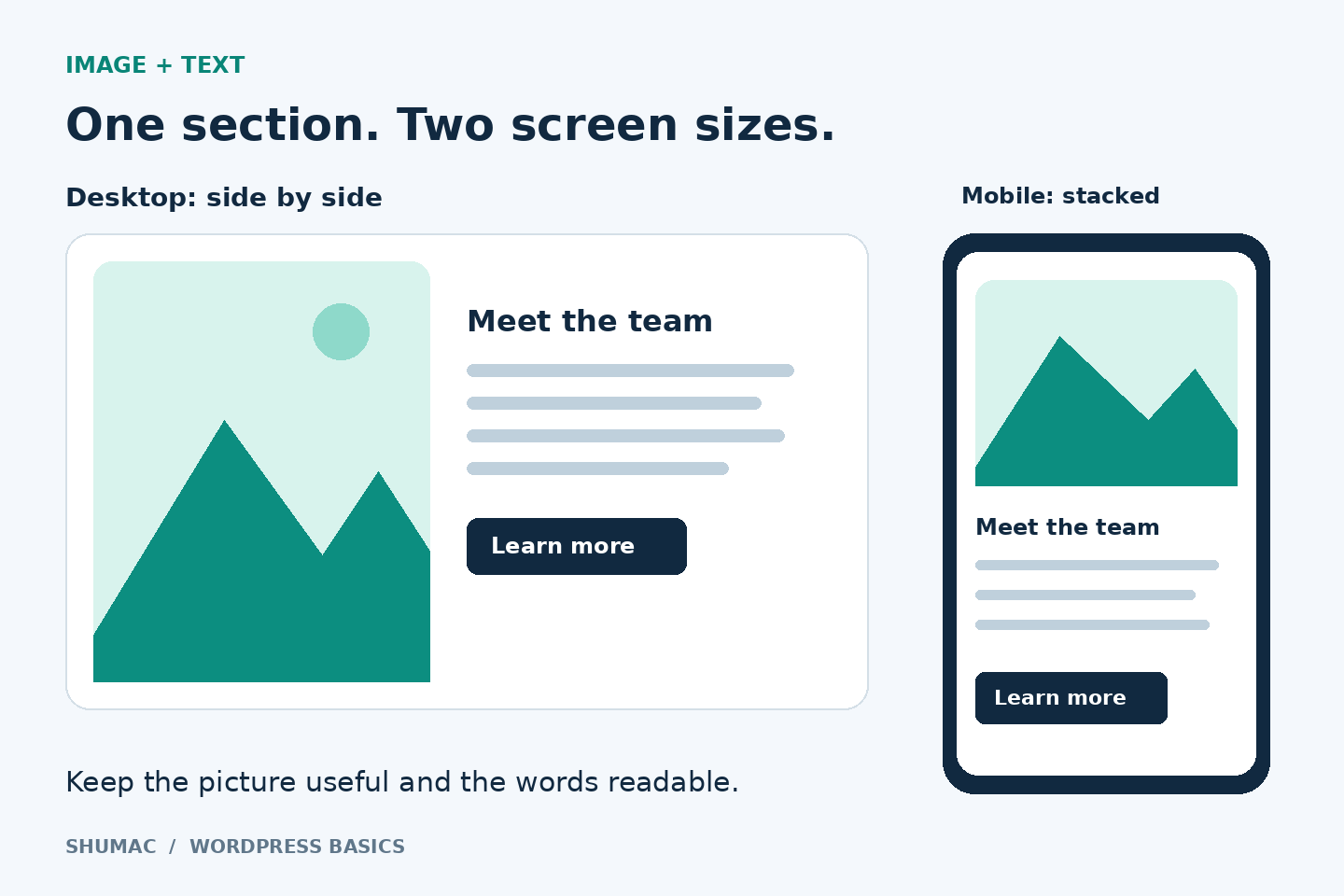
A team photo beside a short introduction can make an About page easier to scan. But forcing a picture and a paragraph into a narrow row often leaves the words squeezed against the edge. Start with WordPress’s native Media & Text block, then check the small-screen version before publishing.
This guide is for the WordPress block editor, not Elementor or the Classic Editor. You do not need an extra layout plugin for this section. Save a draft first if you are experimenting with an existing page.
1. Give the section one job
Choose a picture that supports the text: your team for an introduction, a finished project for a case study, or a product detail beside an explanation. Avoid a decorative image that competes with the message. A useful starting layout is one heading, two short sentences and one next step.
For example, an imaginary repair business might use “Meet our workshop team,” a photograph of its staff, and a “View our services” button. Do not put essential instructions inside the photograph; keep those words in editable text so they remain readable.
2. Add the Media & Text block
Open your post or page, click the block inserter (+), and search for Media & Text. Select it, then upload an image you have permission to use or choose one from the Media Library. Click the content area and add your text. You can insert a Heading or Buttons block there too.
Use the toolbar’s media-left or media-right control to choose the arrangement. If you keep selecting the paragraph instead of the whole section, open List View and select the parent Media & Text block. The available controls can differ with your WordPress version and theme.
3. Balance the picture and the words
In the block settings, adjust Media width rather than adding spaces or empty paragraphs. Try a roughly even split first. If the picture dominates, make its share smaller. Use vertical alignment to position the text at the top, middle or bottom of the media area.
If you enable Crop image to fill, check the focal point: a good-looking rectangle is not useful if it cuts off a face or the part you are explaining. Turn cropping off when readers need to see the complete image, such as a diagram. See the official block controls for details.
4. Make the narrow layout readable
Enable Stack on mobile in the block settings. The image and text can then appear vertically instead of remaining in two small columns. Preview the page at a narrow width and read the section from beginning to end. Confirm that the picture, heading and next step appear in a sensible order.
If the result feels too tall, shorten repeated wording before making the font tiny. If the image looks blurry, check the selected resolution and the source file. A larger display size cannot restore detail missing from a small original. Prepare a suitably sized file using our image resizing and compression guide.
5. Check the finished section
- Add descriptive alt text where the image conveys information. Our alt-text guide explains how to write it.
- Check the crop at desktop and narrow widths, including any important faces or labels.
- Test the button or image link. Avoid making a decorative picture clickable without a useful destination.
- Preview outside the editor before updating the live page. Theme spacing may differ from the editing canvas.
Keep the first version simple. One well-chosen picture and a clear explanation are enough; add more sections only when they answer a different visitor question.
Further reference: WordPress.com’s Media & Text guide covers mobile stacking, image size and crop settings. Its service-specific media options may differ from a self-hosted WordPress site.