How to Put Text Over an Image in WordPress
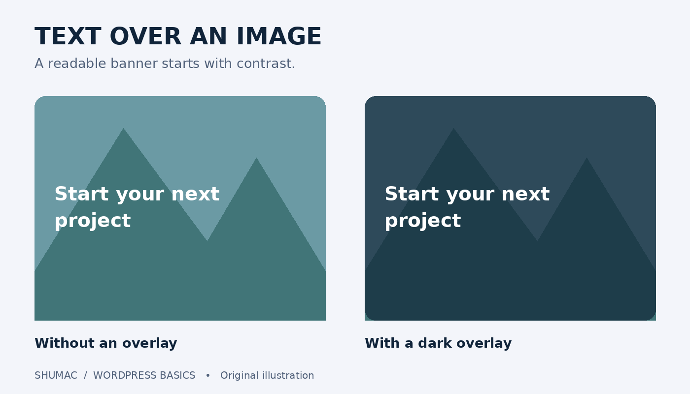
A photograph can make a banner more inviting, but the message still needs to be easy to read. WordPress includes a Cover block for placing text over a background image, without turning the words into part of the picture.
Start with a simple banner
Choose one short message, such as “Start your next project,” rather than a full introduction. Use a photo you own or have permission to publish. Leave the detailed explanation below the banner, where visitors can read it comfortably.
If the picture needs to sit alongside the words instead, follow our guide to putting an image beside text. That is often a better choice for a portrait, product description or long paragraph.
Add the Cover block
Open the page or post in the WordPress block editor. Insert a Cover block using the block inserter, or type /cover in an empty paragraph. Upload your image or choose one from the Media Library, then enter your message inside the block.
Select the Cover block itself to see its settings. Adjust its overlay color and opacity until the words stand out. Use the focal point control to keep the important part of the picture visible when it is cropped. The available controls can differ with your WordPress version and theme.
Make the words easier to read
A busy photo competes with text. Try a dark overlay behind light lettering, or use a simpler image with an uncluttered area. Do not judge the result only from the darkest corner: check every word against the background immediately behind it.
Keep the headline short enough to wrap naturally on a phone. Avoid inserting manual line breaks just to make one desktop view look perfect. Keep essential information as actual text, not text baked into an uploaded graphic.
Check the whole banner before publishing
Preview the page at desktop and mobile widths. Look for awkward cropping, tiny words and a banner so tall that it hides the next section. A shorter message is usually a better fix than shrinking the type.
If you add a button, give it a specific label and check its destination. Our WordPress button guide covers that separately. The banner image should support the action, not distract from it.
Common problems and quick fixes
The subject disappears on mobile: adjust the focal point or choose a less tightly cropped image. The text blends in: strengthen the overlay or change the photo. The section feels crowded: move supporting sentences below it. The wrong settings appear: select the outer Cover block instead of its paragraph.
For the current control names and options, see the official WordPress Cover block documentation and the Learn WordPress lesson. Start with one banner, check it carefully, and reuse the approach only where an image genuinely helps explain the page.